Dress for Success
Type
Team
Role
UX/UI Design UX Research
UX Designer UX Researcher
4 UX Students
Duration / Year
8 months, 2023-2024
For our UX Capstone project, our team partook in an 8-month UX process with Dress for Success Washington, D.C. (DFSWDC), aiming to deliver effective career support to women through virtual offerings.
This project primarily focused on a redesign of the DFSWDC website that would allow their clients to overcome potential barriers to support such as location and receive the personalized help and connection experienced in person at DFSWDC.
Tools: Figma, Google Workspace
The Overview
What is Dress for Success?
Dress for Success Washington, D.C. (DFSWDC) is a nonprofit organization run by women for women.
Their mission is to “empower women to achieve economic independence by providing a network of support, professional attire, and the development tools to help women thrive in work and in life."
Problem
Regardless of location and life circumstances, underserved women in the D.C. area who are working towards career goals need a way to:
Following the pandemic, DFSWDC expanded its virtual presence in hopes of offering the same support. However, there has been a disconnect between their virtual and in-person offerings.
Our Goals
After having conversations with DFSWDC, we were able to set up these major goals that align with their needs and values:
Redesign DFSWDC’s mobile website to help women access support that helps them achieve their career goals – despite any external circumstances.
Our Process
The Research
Heuristic Evaluation
Participants
Our team served as evaluators of the website. We evaluated the DFSWDC website, including the Virtual Career Center (VCC), for its adherence to UX guidelines.
Findings
The heuristic evaluation identified that the DFSWDC website violates 7/10 usability heuristics, shown below.
Competitive Analysis
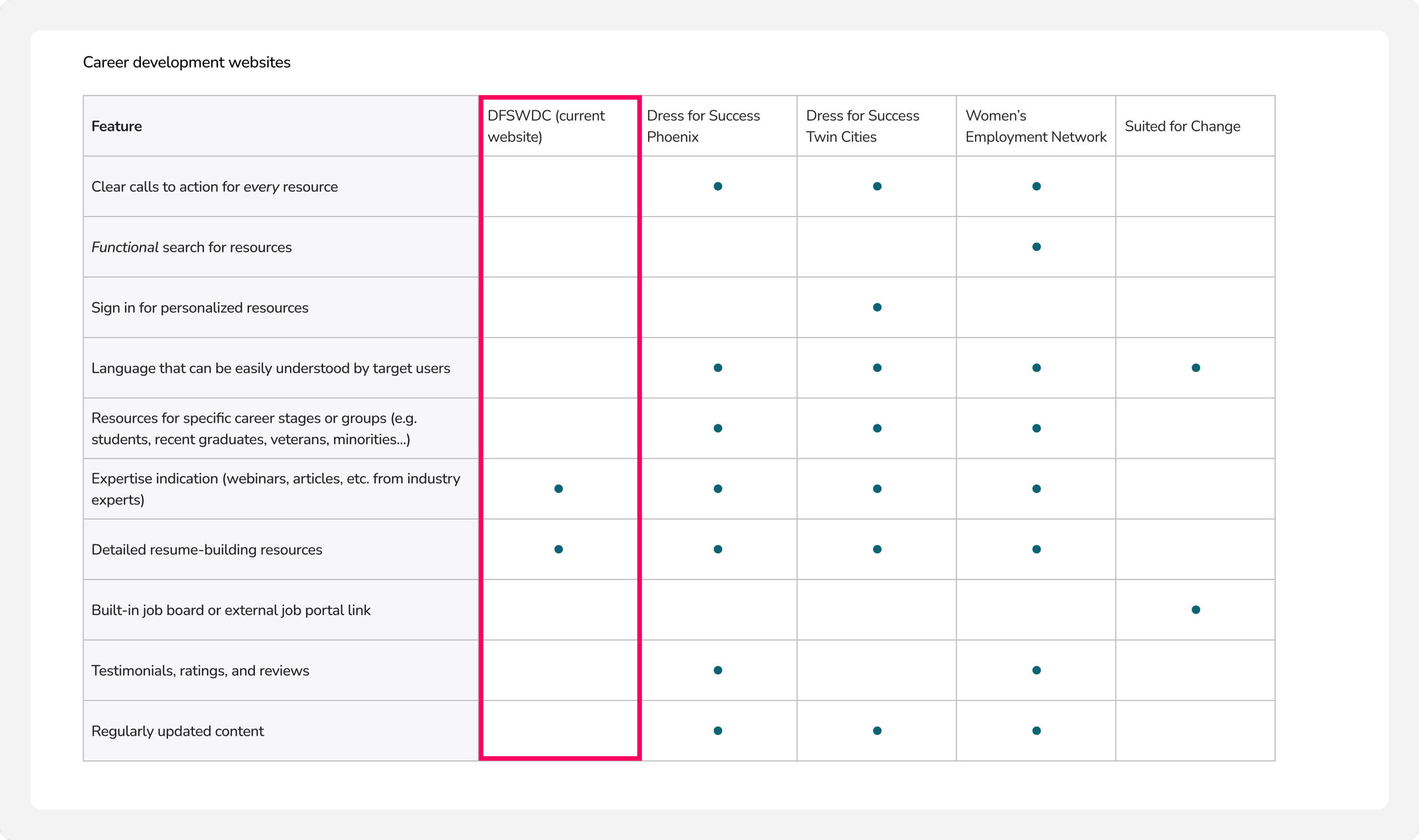
The competitive analysis below revealed that out of the 10 standards identified, DFSWDC only follows 2. Compared to other Dress for Success company websites in other cities, DFSWDC scored the lowest out of all.
User Interviews
Participants
During the interview process, our team interviewed a total of 8 participants. They all had different backgrounds, history with the organization, and experiences with the website.
6 out of the 8 participants are clients of the service and the other 2 are volunteers working with DFSWDC.
Key Finding #1:
Along with career coaching, clients of DFSWDC rely on volunteers to fill in the gaps on the website. Volunteers are not always able to support clients in this process and wish the client could independently navigate these things.
Key Finding #2:
Many long-time users are unaware of the VCC's existence. If they are aware of it, they still do not use the resources available within it.
Key Finding #3:
In-person/synchronous resources and interactions leave users feeling positive emotions.
Usability Testing
Participants
We also received insights about feelings and behavior from 8 participants as they navigated the current website. Each of these participants was new to the website and had never used it before. They each had varying backgrounds, ages, and occupations.
Tasks
Find the Virtual Career Center.
If you were looking for resources on creating a resume, where would you go?
Show me where you would go if you wanted to find tips on how to dress for an interview.
If you were looking to get a career coach, how would you go about starting that process?
If you were looking to make a federal resume specifically, how would you find a template for it?
Findings
Overall, each task was able to be accomplished by the majority of participants but not with ease. Every task required a higher level of effort, time, and error to accomplish for at least one of the participants. From this, we were able to identify key issues within problematic pages.
Issues Identified:
Analysis
Themes & Insights
The Ideation
User Personas & Journeys
Based on our research, we created two primary personas (a new DFSWDC user and a user who has been with DFSWDC for five years) and one secondary persona (a volunteer coach).
We also created three user journey maps – one for each of our personas. These deliverables are intended to help us make sure that our experience redesign is tailored to the specific needs and behaviors of target users. It also helps us gain empathy for users and understand the context in which they will be using the VCC.
Design / UX Requirements
The Design
& Iteration
Design Process
We used an iterative design approach for the design phase. We had 2 rounds of user testing and 2 major iterations of our prototype (one in low fidelity and one in high fidelity).
Sketches
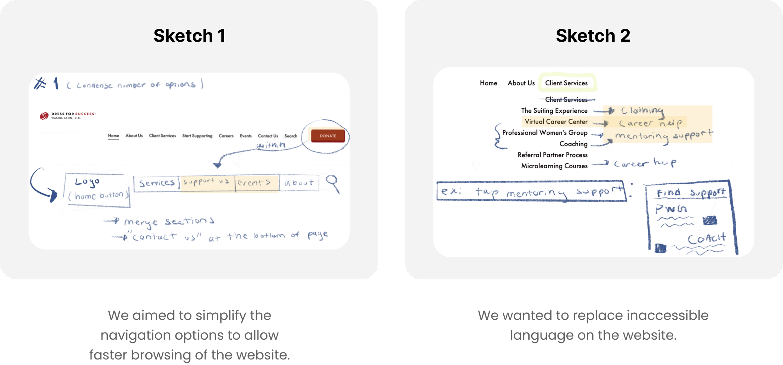
We began our design phase by sketching potential solutions that would address each of the design requirements that emerged from our research phase. Each came up with 6 designs for each design requirement we had, having a total of 24 sketches that helped us shape our design.
User/Task Flows
Next, we mapped out all of the user flows and task flows for all the flows that we wanted to change or add on the website.
Lo-Fi Wireframes + Prototype
Then we began creating low-fidelity wireframes of the pages we needed to fulfill all of the user and task flows mentioned above.
We started with low-fidelity versions because we wanted to perfect the basic structure of these pages before adding higher-fidelity visuals and branding elements.
User Testing
After creating our first low-fidelity prototype, we conducted user testing with 8 participants who had never used DFSWDC’s website before. We found the following insights from this:
After implementing the necessary changes, we conducted another round of user testing. These were the insights that emerged from this round:
The Final Design
1
Navigation Menu
We prioritized user-centric language in our navigation menu redesign. We cut down on the number of dropdowns available in the navigation menu while still ensuring that every page on the website could be accessed through it. This allows users to quickly scan the dropdown labels and get an overview of what is available to them.
We also added descriptors to certain page titles that were not easily understood by users during preliminary usability testing. This is helpful to first-time visitors who have not yet become familiar with the terms and phrases used by Dress for Success to refer to their resources.
Onboarding Questionnaire
2
Many long-time users of DFSWDC are used to actively interacting with the staff and volunteers at DFSWDC who take time to understand their career goals and how they can best serve them. To emulate this effort to understand users online, we designed an onboarding questionnaire that users can choose to take immediately after signing up for an account or later from their profile.
This questionnaire allows users to share their career goals and what they are looking to get out of DFSWDC’s resources. It also helps customize other features on the website later on so that users can easily access the resources that will be the most helpful to them.
3
Profile/Dashboard
With our addition of a profile feature, users can now track their progress toward their career goals by viewing metrics related to their usage of DFSWDC resources. This is intended to help them visualize the benefits they are getting from these resources.
They can also easily view resources that are related to their specific career goals that they specified during their onboarding questionnaire, as those will be recommended to them on their dashboard.
4
Virtual Career Center (VCC)
We have revamped the VCC interface to allow DFSWDC users to see all the resources available to them at a glance. Previously, it was unclear how the VCC could be useful to users, but now, all of the resources are explicitly listed on this page and are also categorized into clear and distinct sections.
The search feature also enables users to quickly find the information they need. As for each resource page, we have provided users with step-by-step instructions to help them understand how they can actually begin to use each resource.
Events and Community
5
With our new page to view all events, users can quickly get a chronological overview of events that DFSWDC is hosting. They can also view all the details for each event on their corresponding event pages and even join Facebook groups for each event so that they can connect with others who are attending, even if the event itself is virtual.
This is intended to foster a sense of community amongst users that is similar to the community that they have found at in-person events in the past.
6
Career Coaching
With our new scheduling system, users are now able to view volunteer coaches’ profiles, see their availabilities, and fill out a form within the website to get started with this process. They can also view notes from their coaching appointments directly on the website, which makes it easier for them to reference resources that have been shared with them during these coaching sessions.
The Evaluation
Evaluation Process
Upon starting our evaluation process, we focused on 4 main user flows and 5 research questions:
User Flows
Register for an account to view a personalized dashboard with resource usage metrics and recommended resources
Find and utilize career resources on the Virtual Career Center (VCC) page
Apply to be matched with a coach and schedule career coaching appointments
Register for career development events and connect with other attendees
Research Questions
Can users logically navigate the website when trying to complete tasks and find resources?
Can users understand all of the language that appears on the website?
Can users successfully view and schedule upcoming events
Can users successfully apply for career coaching and stay in contact with their coach?
Are users able to feel a sense of community and support from others?
Testing
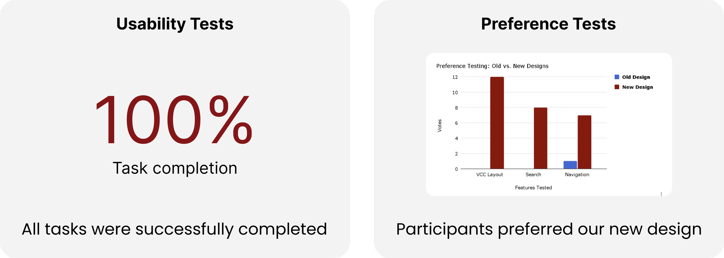
Our evaluation study utilized single-system usability testing to assess new features' functionality and preference testing to gauge user preferences regarding design changes. By structuring tasks to evaluate key user flows, the study ensured a comprehensive assessment of the website's usability and effectiveness.
Insights & Results:
Insights gleaned from the evaluation study provided nuanced understanding and actionable insights for refining the final design.
Key findings included improvements in navigation, challenges related to language clarity, opportunities for enhancing event management features, and varying perceptions of community support while still allowing for 100% usability test completion and intuitive user flows.


