
UX RESEARCH · DESIGN
Dress for Success
An uplifting platform dedicated to empowering women by providing virtual resources and mentorship to help them achieve their career aspirations.
🥇 UMSI EXPO’24 DEI THEME
my role.
Lead UX Designer
UX Researcher
team.
4 UX Students
Dress for Success

tools.
Figma
Google Workspace
duration.
8 months, 2023-2024
Working with a Real-World Client 🤝
This 8-month project was a full-scale UX redesign of the mobile website for Dress for Success Washington, D.C. (DFSWDC)—a women-led nonprofit empowering women.

The Problem
Underserved women in the D.C. area face challenges in building meaningful connections and receiving support to achieve their career goals.
The Goal
Redesign DFSWDC’s mobile website to help women access support that helps them achieve their career goals – despite any external circumstances.

The Process
The Impact
Expanding Access, Strengthening Support, Enhancing Connections
Optimized navigation by
streamlining menu options from 20 to 10Transformed the coaching process, reducing time from
3-5 days to just 15 minutesEliminated phone calls and manual steps, saving staff and clients over 45 minutes per meeting
The Solution
Tailor Your Experience 🎯
Designed to personalize the experience, this optional questionnaire helps users share career goals and access the
most relevant resources.

Track Your Growth 📊
Users can track progress/metrics, check schedules, and access career resources tailored to their goals.

Explore Your Resources 📚
The revamped Virtual Career Center offers a clear, categorized layout with all resources at a glance.
A search feature and step-by-step guides make it easy to find and use the right tools.

Stay Connected & Engaged 🤝
The new events page provides a clear, chronological view of all DFSWDC events.
Users can explore event details, join Facebook groups, and connect with others to build a strong community—whether in person or online.

Get Coaching & Support 🗣️
Our new scheduling system lets users view coach profiles, check availability, and book sessions directly on the site.
Coaching notes are also available, making it easy to reference shared resources anytime.


Research Methods
Main Findings
Users struggle with navigation, relying on volunteers and underusing key resources
These are the key findings from the user research conducted. While I reviewed findings from the heuristic evaluation and competitive analysis, my primary contributions were conducting user interviews and leading usability testing with participants.


Analysis
So, what’s creating the disconnect?
Inconsistent design and unclear calls to action limited access to personalized resources, with users preferring in-person support. Here are the key insights from the user research.
User Personas & Journeys
Representing the needs of all 3 user groups
Building on our research, I created 2 primary personas (a new DFSWDC user and a long-term user) and 1 secondary persona for a volunteer coach, reflecting the 3 key stakeholder groups: clients, long-term users, and volunteers.
I also developed user journey maps for each persona to ensure our redesign addresses their distinct needs and behaviors, helping us empathize with their unique VCC experiences.

Primary


Secondary
Design / UX Requirements
Our final solution should include…
Based on the research-informed personas and user journeys, we defined the following UX design requirements to guide the website redesign, ensuring it effectively meets users' needs.

Design Process
Iterative design process with user testing

We used an iterative design approach for the design phase. We had 2 rounds of user testing and 2 major iterations of our prototype (one in low fidelity and one in high fidelity).
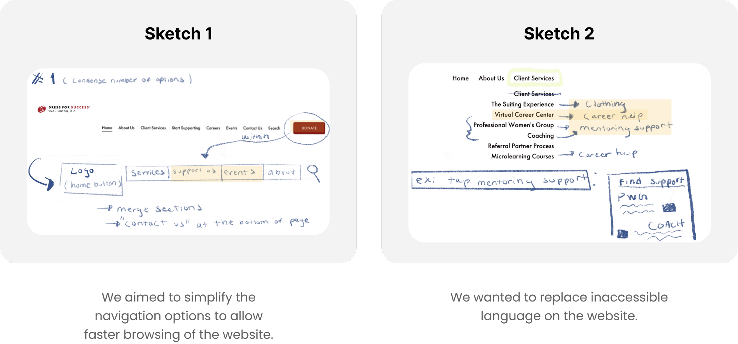
Sketches
During the design phase, I sketched two concepts for each UX requirement, resulting in 24 team-wide sketches. These sketches were pivotal in guiding our final design direction.
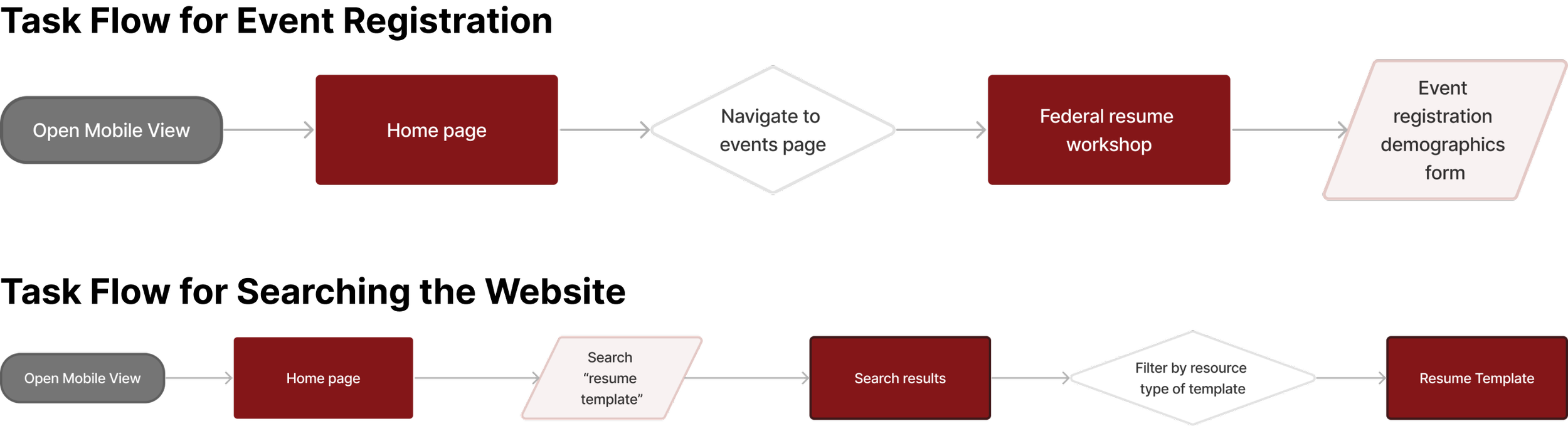
User/Task Flows
Mapping out the 4 key interactions
Next, we collaboratively mapped out user and task flows for all the interactions we aimed to improve or introduce on the website.

Lo-Fi Wireframes + Prototype
Research driven and user-focused
Inspired by research on career platforms like LinkedIn, Handshake, and Indeed, I created low-fidelity wireframes to align with our mapped user and task flows. I focused on refining the personal dashboard, scheduling interactions, and event registration, which helped establish a solid foundation for later high-fidelity design and branding elements.

User Testing
Confusion, inconsistency, and mental Load!
After developing the low-fidelity prototype, I led 2 user testing sessions with participants who had never used DFSWDC’s website before.
From a total of 8 test results, we uncovered the following key insights:

After implementing the necessary changes, we conducted another round of user testing. These were the insights that emerged from this round:

Final Design
Introducing The New DFSWDC 💡
Before

After

The Evaluation
Evaluation Process
Upon starting our evaluation process, we focused on 4 main user flows and 5 research questions:
User Flows
Register for an account to view a personalized dashboard with resource usage metrics and recommended resources
Find and utilize career resources on the Virtual Career Center (VCC) page
Apply to be matched with a coach and schedule career coaching appointments
Register for career development events and connect with other attendees
Research Questions
Can users…
logically navigate the website when trying to complete tasks and find resources?
understand all of the language that appears on the website?
successfully view and schedule upcoming events
successfully apply for career coaching and stay in contact with their coach?
feel a sense of community and support from others?
Testing
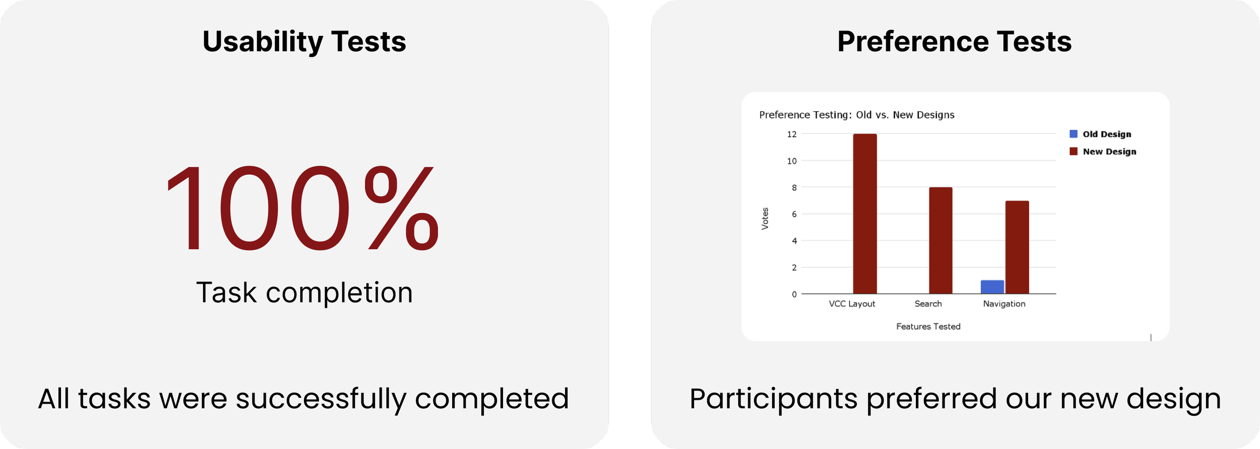
Our evaluation study utilized single-system usability testing to assess new features' functionality and preference testing to gauge user preferences regarding design changes. By structuring tasks to evaluate key user flows, the study ensured a comprehensive assessment of the website's usability and effectiveness.

Insights & Results:
Insights gleaned from the evaluation study provided nuanced understanding and actionable insights for refining the final design.
Key findings included improvements in navigation, challenges related to language clarity, opportunities for enhancing event management features, and varying perceptions of community support while still allowing for 100% usability test completion and intuitive user flows.
The Reflection
Lessons ☁️
This project was my first deep dive into working closely with a client, and it transformed the way I approach collaboration. Translating design ideas to non-designers required active listening and regular updates to ensure we met both business goals and user needs.
Challenges ⛈️
Balancing workloads in a long-term group project was tough, especially with everyone’s outside commitments. However, weekly check-ins and open communication kept us motivated and accountable, allowing us to push through and deliver strong design solutions.
Improvements ☀️
This project deepened my understanding of collaboration—not just dividing tasks, but building on each other’s ideas. I’ll carry this mindset forward, embracing teamwork as a way to create more impactful and innovative designs.

