UX RESEARCH · DESIGN
MOSAIC
An inclusive app that provides queer individuals with a safe space to listen to and share memories from their community.
my role.
UX Designer
UX Researcher
team.
5 UX Students
tools.
Figma
Miro
duration.
3 months, 2023
The Overview
The Problem
The queer community uses social media for identity resources, but they may be unsafe or inaccurate.
While brainstorming, we talked about how…
The Goal
Create a healthy support system for queer individuals that can help them understand their identity and develop a sense of belonging.
The Solution
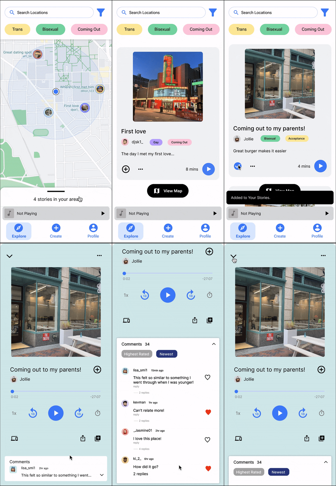
Selecting a Story 📍
Users can click a story icon on the map within their location radius to view and play the story.
They can also filter stories by selecting the tags they want to explore.
Detail list view 📝
Users can pull up the drawer to see a scrolling list of available stories.
They can save stories and enter a larger detail view to interact with comments.
Creating a Story ✍️
Users tap the create icon and follow prompts to record, add details, and submit their story for review before approval and posting.
A safeguard is included to prevent stories from revealing personal information that could compromise safety or identity.
Profile 🧑💻
Users can view their saved stories, memories, and tags on the profile page.
Embedded Memories 🎨
Users can add and view visuals throughout their walk using AR, receiving notifications of embedded memories along the way.
The Research
White Paper Research
Understanding LGBTQ+ challenges…
Initially, I delved into research to deepen my understanding of the challenges faced by LGBTQ+ individuals, particularly younger members.
As a student from Korea, I empathized with those, who like myself, had not received inclusive sexual education, and keeping this data in mind during further user research was valuable in enhancing my understanding.
Competitive Analysis
An interactive & entertaining platform that doesn’t feel like a sterile information dump 🌟
I conducted a competitive analysis of three platforms to identify strengths and areas for improvement. This helped us shape a direction for our product that is both educational enough to make an impact and entertaining enough to engage young people.
User Interviews
Ages 16-25, young LGBTQ+ people
To gain a stronger understanding of the needs or expectations that queer individuals might have, I recruited and interviewed 2 participants who identify as young LGBTQ+ people, ensuring a range of identities were represented.
Analysis
The power of Community, Representation, and Personal Growth
Key Findings
The Ideation
User Personas & Scenarios
Representing different queer archetypes
Then we created 3 user personas of different queer archetypes
(out, closeted, and someone in an unsafe place to come out) to better empathize with our target audience and understand their needs.
Framing the persona development around the coming out process/journey helped us isolate and differentiate attributes for our users.
3 main personas focus on:
a trans woman in the earlier stages of transitioning
a gay woman who needs a sense of community to help with her coming out process
a bisexual man who feels like he can’t fully live his truth in his situation where it is unsafe to come out
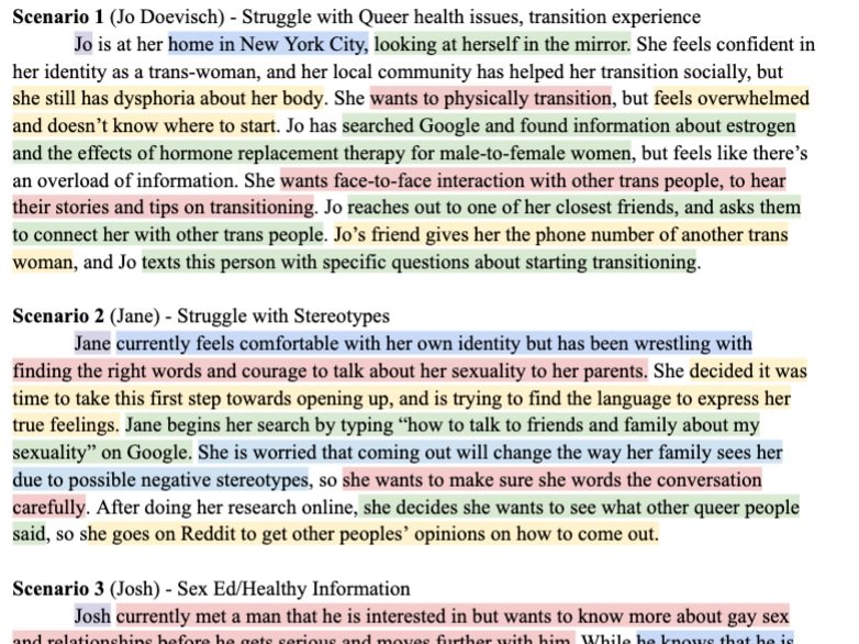
We then together created scenarios that describe the background context of pain points, challenges, and problems each of our personas might face.
This step helped us reflect on our current direction with each persona, taking a step back to understand the intentions of our product and what problems we are trying to solve.
From there, I designed storyboards that walked through some of these specific scenarios that helped us further empathize with our user base and figure out the need for a design solution to address their pain points.
Solution Ideation
Let’s allow users to connect with other queer people in their immediate physical area, which can help them understand their identity and develop a sense of belonging.
Our 3 MAIN DESIGN GOALS:
Allow users to share queer stories in a safe, anonymous way
Encourage interaction with local community to tie the stories to tangible places and enhance user's sense of physical community
Enable interaction between users within the bounds of a story
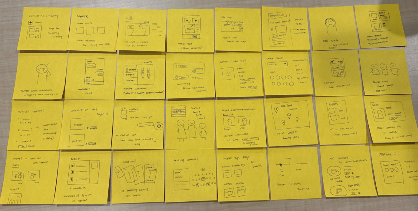
Then I took some time visualizing our solution’s use and impact and created sketches of any ideas/potential solutions related to our design problem.
Ideas we liked:
Guided walking tours (Our final choice)
Queer penpals
Shared identity journals …
We were inspired by…
Pokemon Go: users are not able to listen to the stories unless they’re within certain radius to encourage interaction with the community
Queering The Map: a map of queer stories, but with user-submitted audios for our product(mini podcasts, authentic queer stories)
Bathroom Stall Messages: a platform where users can feel a sense of belonging and leave comments to cultivate a warm, safe space
User Flow Diagram
So, how would it work?
After brainstorming, we created a user flow to organize the structure of the mobile app that will guide users in navigating to reach their 3 end goals:
Listening to stories
Creating and submitting their own stories
Viewing individual story comments
This served as the “blueprint” for creating our wireframes and final prototypes, showing how our screens and interactions connect.
The Design
& Iteration
Lo-Fi Prototype
Translating our concepts into a prototype, we decided to go with
Queer Story Map style app and began visualizing our design solutions through our first set of low-fidelity wireframes.
1st Usability Test
To get feedback on our information architecture and discover what users might have trouble with, I then performed 2 usability tests before moving on. For the test, we gave users a few tasks to complete to analyze the functionality of the pages.
We logged this qualitative data in usability inspection reports and summarized our initial findings.
Findings:
4 out of 5 users were confused with the Map interaction (pins)
The design for comment section is confusing
The button for creating a story is not clear
There are inconsistencies with scrolling vs. tapping
Hi-Fi Prototype (Version 1)
We then moved on to designing our first version of hi-fi wireframes based on the adjustments we discovered from our test and evaluation. After creating them, we presented our mockups to the teaching team and conducted a 2nd round of usability testing to get more feedback.
2nd Usability Test
Using an updated task list, we tested 5 new users. Overall, the major user flow issues showed great improvement, but we gained some valuable feedback on UI aspects.
1st Major Improvement: Search Bar
2nd Major Improvement: ‘Create’ flow
3rd Major Improvement: Brand Identity
The Reflection
Lessons ☁️
Working fully through this project taught me the importance of having meaningful conversations with diverse teams, especially considering how our product is catering to a minority group. Getting to hear about completely unique perspectives regarding queerness was what really powered our group forward, and helped me think about the most important needs we should reflect in our solution.
Challenges ⛈️
Though we faced challenges at the beginning due to a lack of insights, I learned a lot about queerness and allyship through the process that we were able to apply to our product.
Improvements ☀️
If we had more time…
Further explore ways to design for connection and safety
Design a clear onboarding process for the users to increase usability
See or learn different ways to represent augmented reality interaction in designs


